+ By Dylan Roche
Ever notice that there’s so much more to words on a page, or a poster, than what they say? It’s about the shape of the letters, the size, the coloring, and the illustrations that surround them.
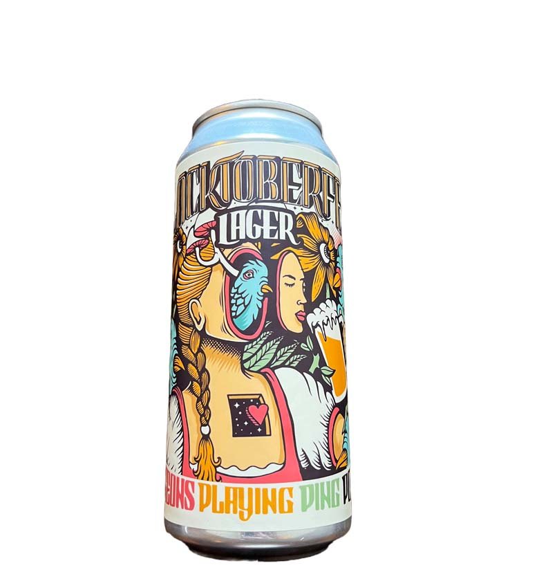
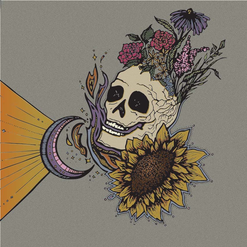
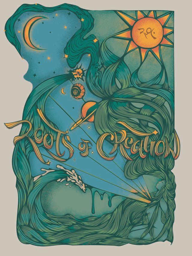
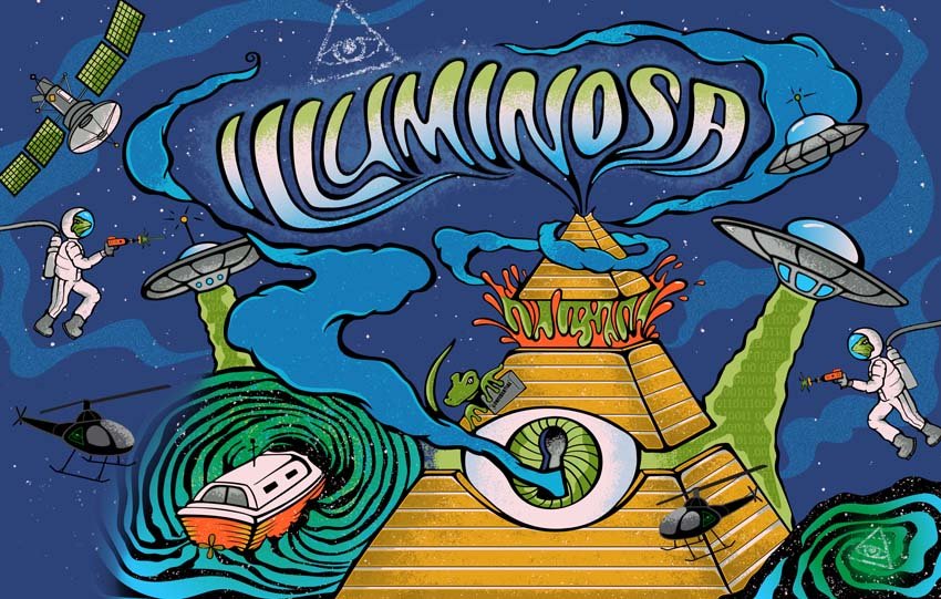
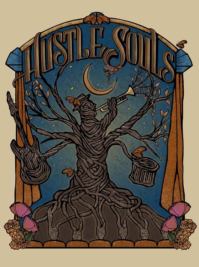
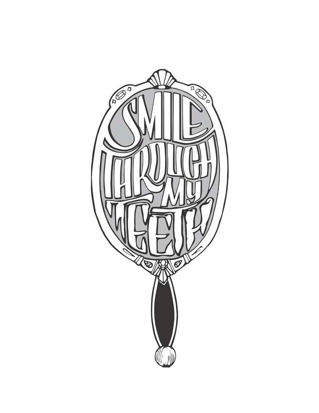
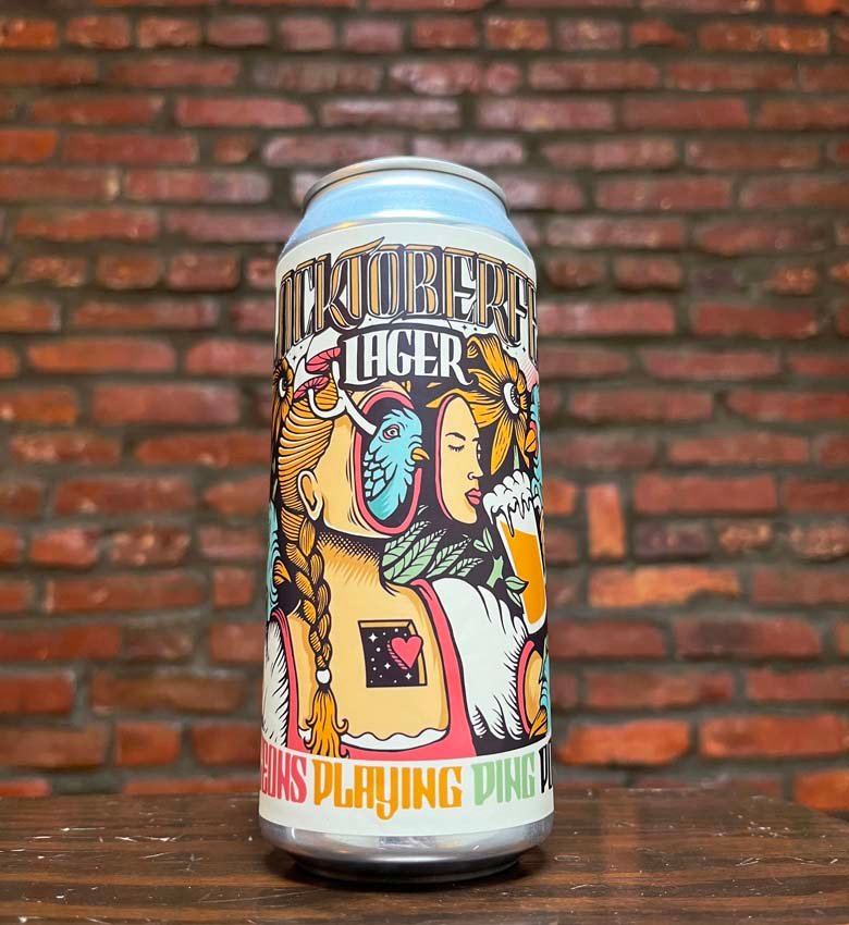
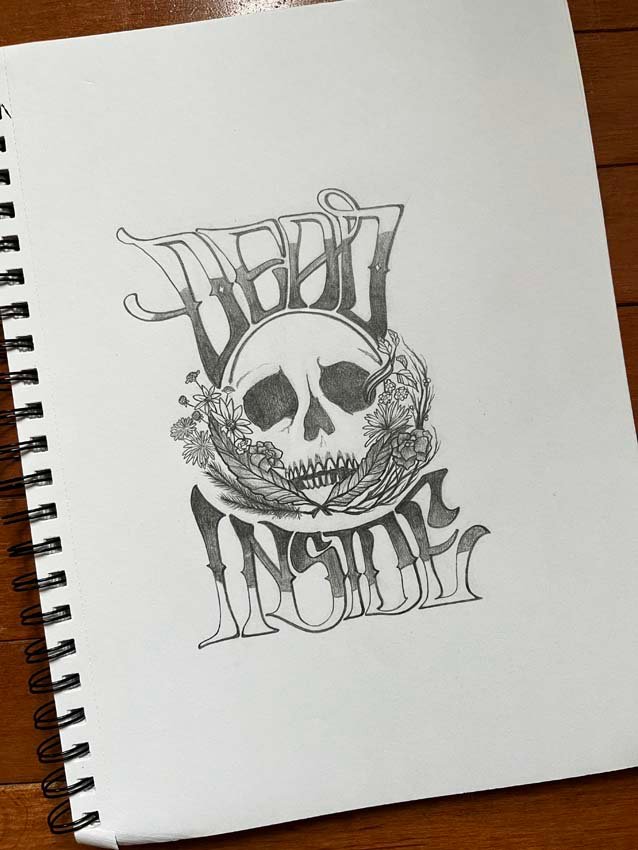
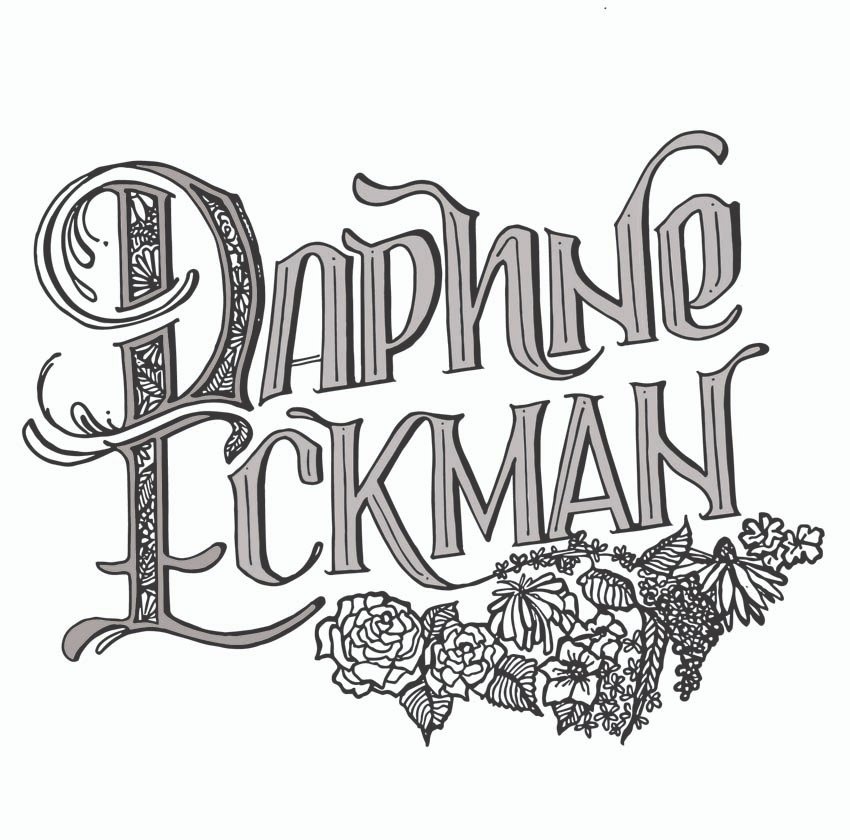
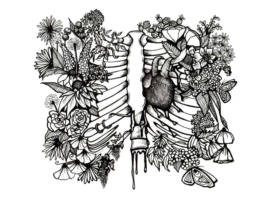
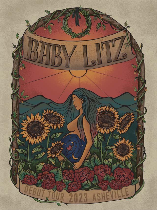
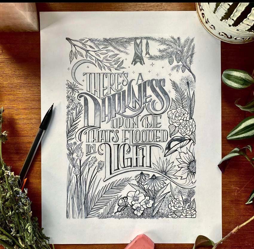
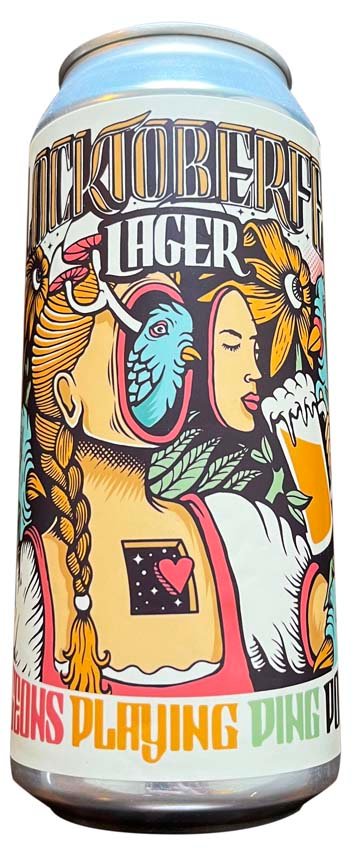
Such is the expertise of Courtney Schoeberlein—artist and illustrator behind her artist persona the Planted Pen—who has captured the essence of many a band, brand, and brewer through her lettering, posters, and other designs. There’s a whimsy and fancifulness to her aesthetic, one that catches the eye and ignites the imagination with its many finely tuned details. It’s expressive, with touches of classic femininity and an organic focus on natural elements. But perhaps the most important aspect of Schoeberlein’s illustrations is the way she captures the mood of whichever client she’s drawing for. “It’s like an actor would get into a role,” she says. “Every piece you do, you really are playing a role for that client.”
It helps that Schoeberlein is intuitive and knows how to get into that mindset. “I listen, I kind of get a read,” she says. “If it’s a musician, I’m going to go listen to their music. I’m going to look at their webpage. I’m going to step into the environment of what I’m working on to the best of my ability.” Once she’s immersed in the mood she’s trying to capture, the illustration comes naturally. “It’s always easier for me to translate my emotions via visual arts,” she says.
Schoeberlein sees herself as toeing the line between fine art and illustration, depending on the piece and what she’s working on in the moment. She’s an illustrator with a base in fine arts, and she identifies more as an illustrator as she progresses in her career, especially in the digital era, when many artists are working on the computer instead of simply with pen and ink.
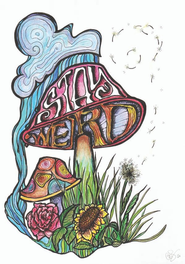
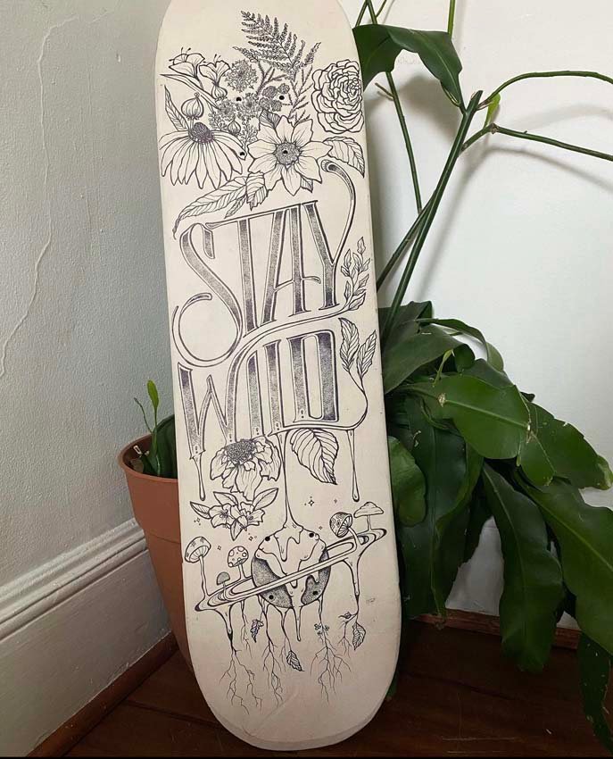
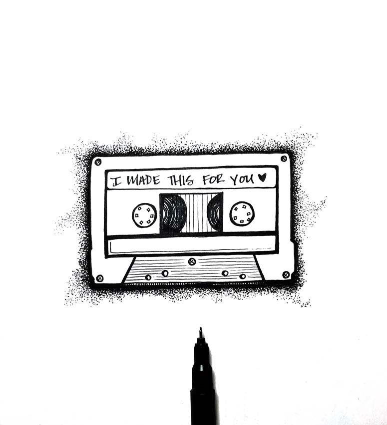
“I’m old-school in the sense that I don’t like to start digitally,” she explains. “So, if I’m going to go digital, I’m always going to start with pencil and paper first and scan that in, as opposed to how a lot of artists now are starting off, sketching right on a tablet or on their screen. . . . Pen and ink is probably my favorite medium. I go through a lot of Sharpies®.”
Indeed, Schoeberlein started going through a lot of Sharpies® from a young age. Her love of lettering and branding started almost as soon as she learned the alphabet and could hold a pencil. She began experimenting with typography, writing out quotes and song lyrics, making posters and magazines, drawing logos, and playing with branding. As she got older, she started studying with summer programs, and after high school, she made her way to Salisbury University, where she earned a Bachelor of Fine Arts in graphic arts.

“College was the biggest and most important turning point for me artistically,” she says. “It’s when I really came into myself and how I wanted to be a creative, finally being surrounded by other artists.” In particular, she credits Paul Flexner, a professor at Salisbury, as being the one who helped her understand fundamentals such as color theory, grid design, and marketability. Under his mentorship, Schoeberlein started working for the university’s art department, giving her more exposure and experience.
Throughout her post-college years, Schoeberlein has made a living in the food and beverage industry while focusing on freelance illustration gigs on the side. “I’m kind of your stereotypical starving artist,” she quips. Recently, she made the leap to full-time artist, and her reputation has earned her a steady stream of work. “It’s a lot of word of mouth, a lot of referrals,” she says.
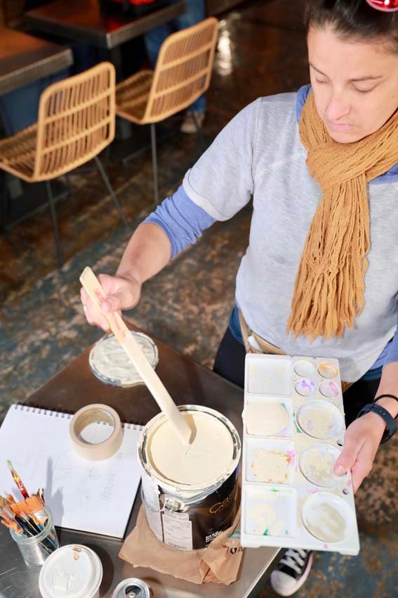
For most pieces, she starts with a sketch. “I spend a lot of time refining my lines,” she says. “I’m very obsessive about small details.” After the sketch, she goes over the lines with her beloved Sharpies®—she orders them in bulk so they are always on hand. After that, she scans the piece and makes digital adjustments using Adobe Illustrator® software. Overall, it’s what she describes as a long, laborious process, whether the work she’s creating is for a client or for herself. From start to finish, it could take between 20 and 40 hours, particularly when she finds herself spending a lot of time perfecting the details. “Last night, I spent five hours readjusting some eyelashes,” she says. “It was insane.”
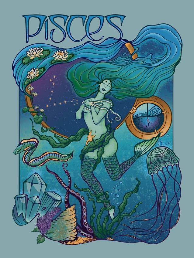
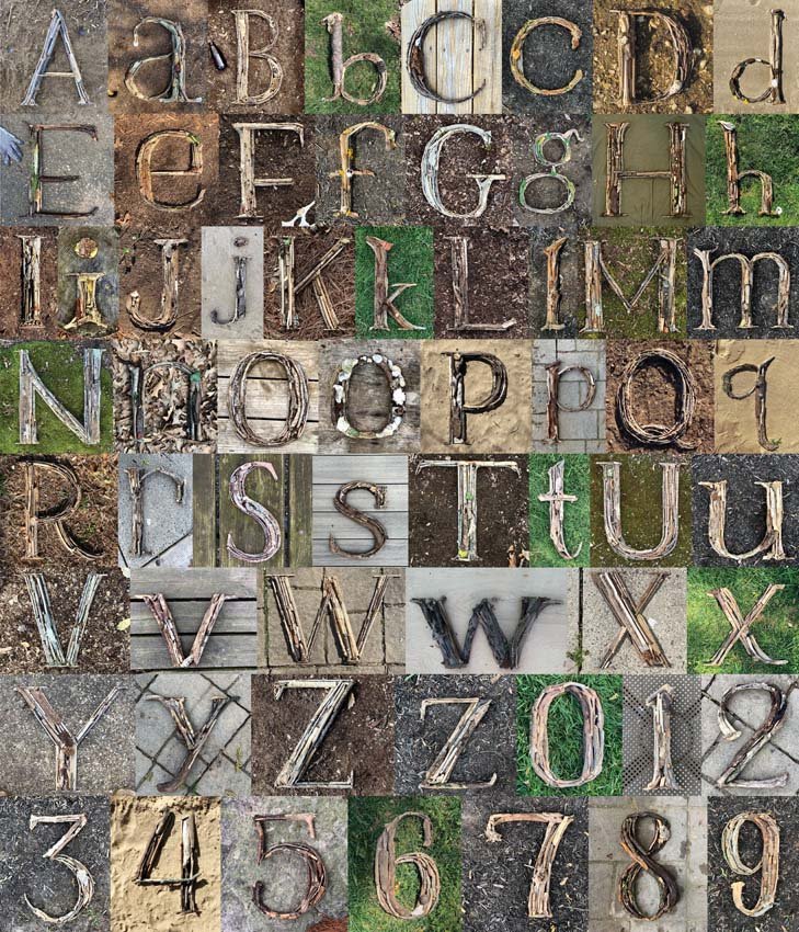
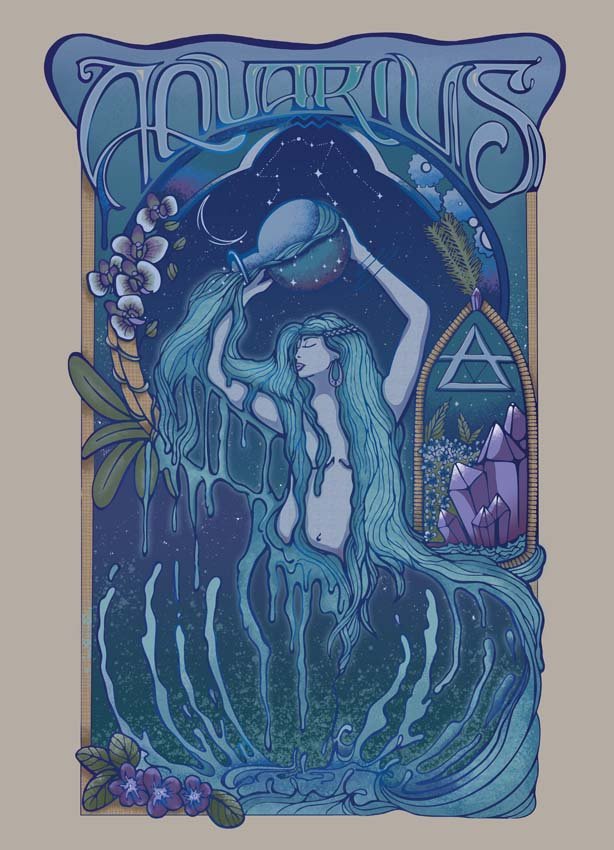
Schoeberlein enjoys working in series, creating pieces that are tied together by theme. At the start of 2023, she began work on illustrating each zodiac goddess during their seasons, starting with Aquarius before moving to Pisces, then Aries, and so forth. Last year, she made a structural outdoor lettering series for which she built one letter from branches and other natural material every day until she made her way through the alphabet. “That’s definitely my biggest passion piece, if I had to pick one,” she says.
Even with her enthusiasm and the success she’s had in taking her art to the professional level, she admits that she struggles with comparing herself to others. “Comparison is a huge challenge for me, especially in the age of social media,” she says. “You’re constantly surrounded by what other artists are doing, what they’re achieving.” In addition, there’s the uncertainty of being a full-time creative. “There’s no guarantee—I don’t have a set income,” she says. “There are no set hours here. It’s a lot of discipline and self-control.”
If the beginning stages of her career as a professional illustrator are any indication, it seems that Schoeberlein has a bright future. She shows no signs of slowing down or letting the momentary doubts get the better of her. “I’m a very hungry person. I’m always just constantly chasing that next big thing,” she says. “I try to keep it positive.” █
For more information, follow
@theplantedpen on Instagram.